brand design case study
how celestial air came to life (and death) for ‘Crash Course’
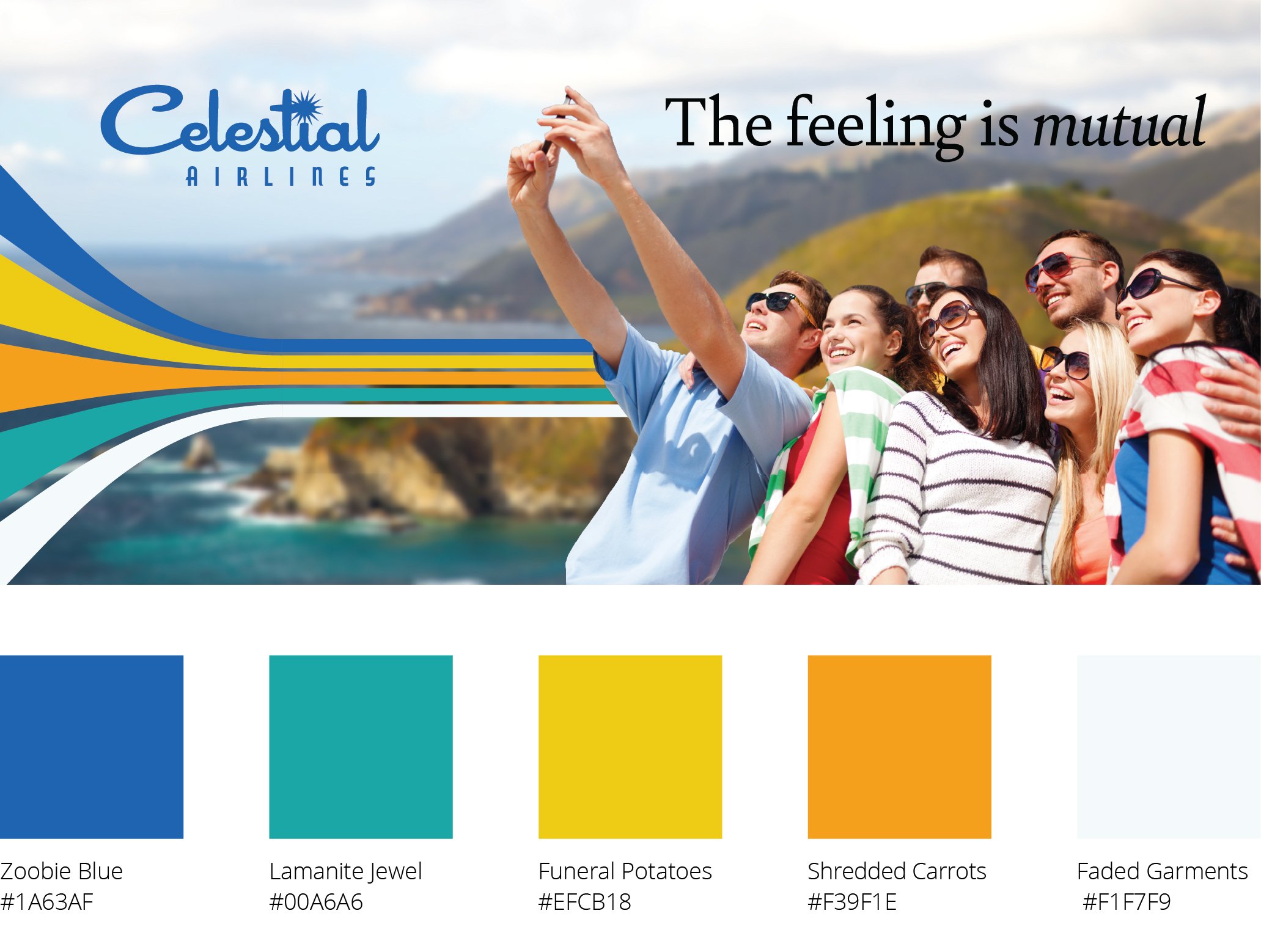
I love to design brands, and I love to travel. So when DJB Design was asked to design a brand for a new airline, I was in heaven — quite literally. The founders of this new airline, Celestial Air, wanted the branding to evoke aspirational travel. Think 1960s travel agency posters that made you pine for a far-off destination. Your dream vacation awaits.
If you haven’t heard of Celestial Air, well, that’s because it’s not a real airline. It’s part of “Crash Course,” a new storytelling show by Nicole Hardy and Jennifer Warnick. So while the airline wasn’t real, my branding efforts most definitely were.
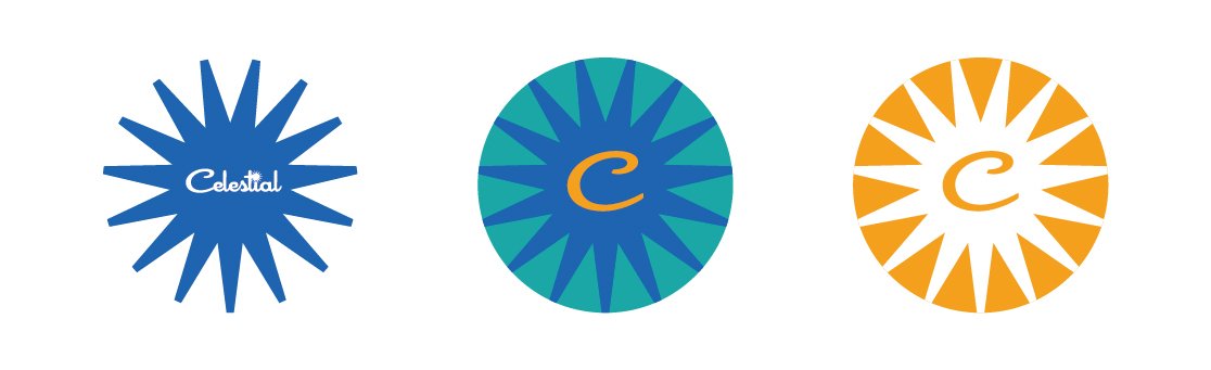
To create Celestial Air, I started with three different brand concepts: one vintage look that hearkens the colors, typography and allure of air travel from the 1960s and 1970s; a timeless modern classic airline with bold but beautiful colors; and a sunset, ethereal theme among clouds awash in purples, blues, peaches and pinks.
Ask: Create a visual brand for a fictional airline to be used in a staged production.
Tools: Adobe Creative Suite
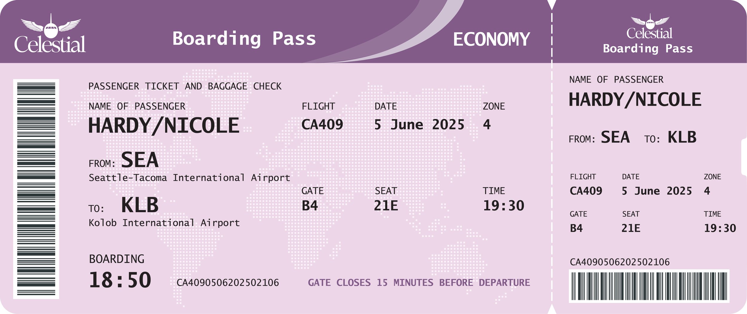
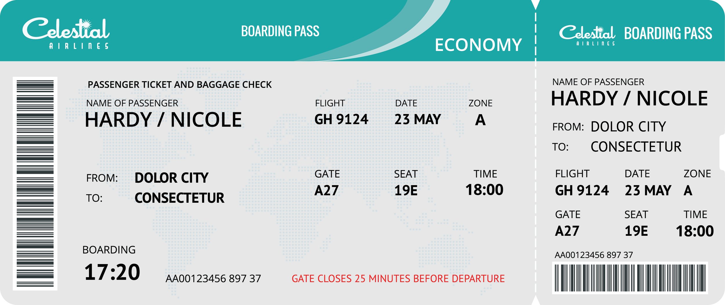
Deliverables: Airline branding package including logos, color schemes, fonts and brand voice; show logo; show poster; 12-page show program styled as an in-flight magazine; airline-branded props to be used on stage; show creative for social media and website
Timeline: 1 month
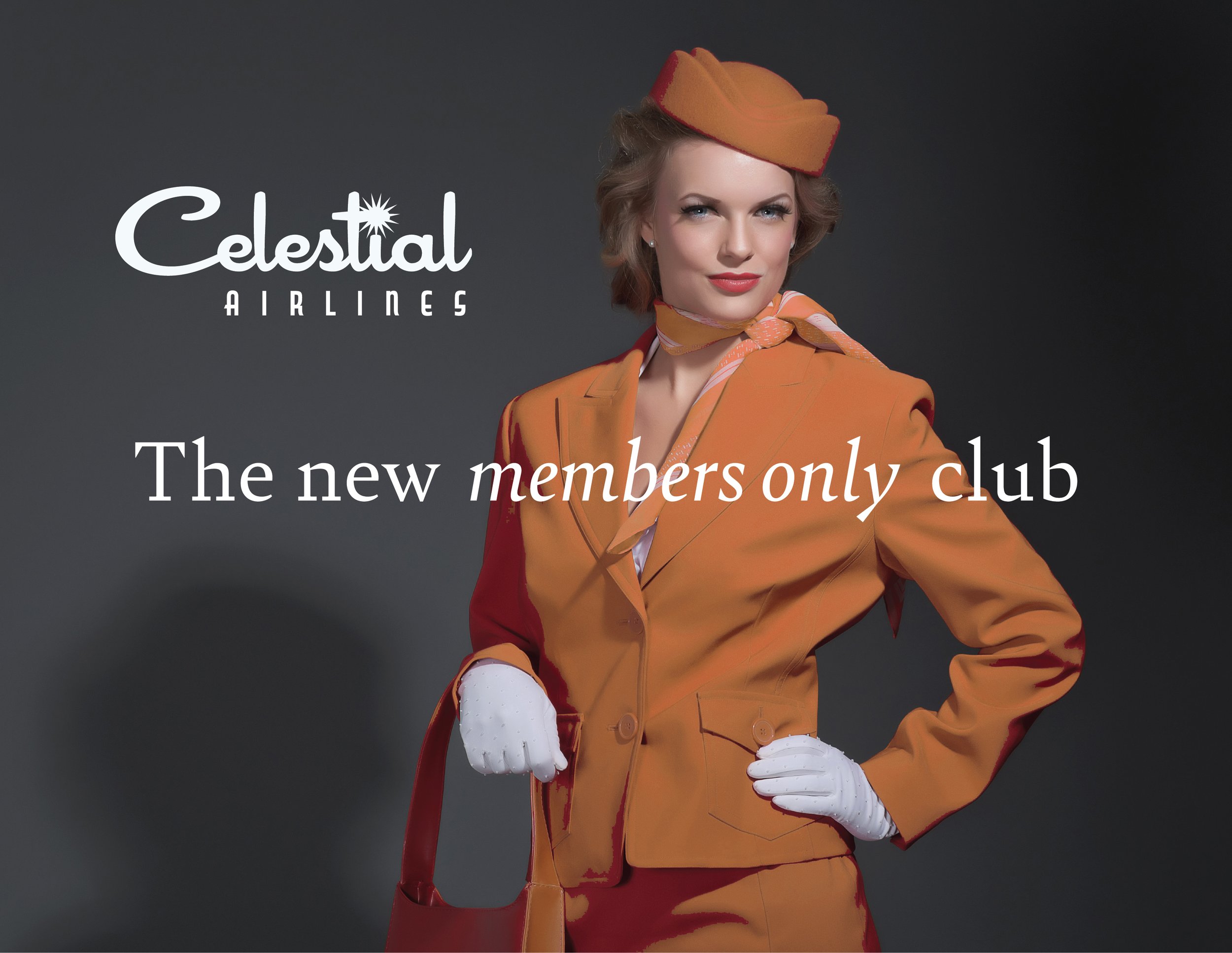
Retro
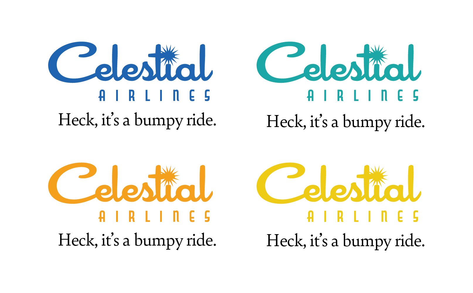
In high school, I drove a salmon-colored 1959 Ford Fairlane Galaxie 500. Was I nominated for best and worst car in my senior yearbook superlatives? Yes! But I loved the script of “Fairlane” across the trunk. This look reminds me of that somewhat and calls back to the romantic ideal of travel on a luxury airline. The dotted “i” in “Celestial” is replaced by a starburst.
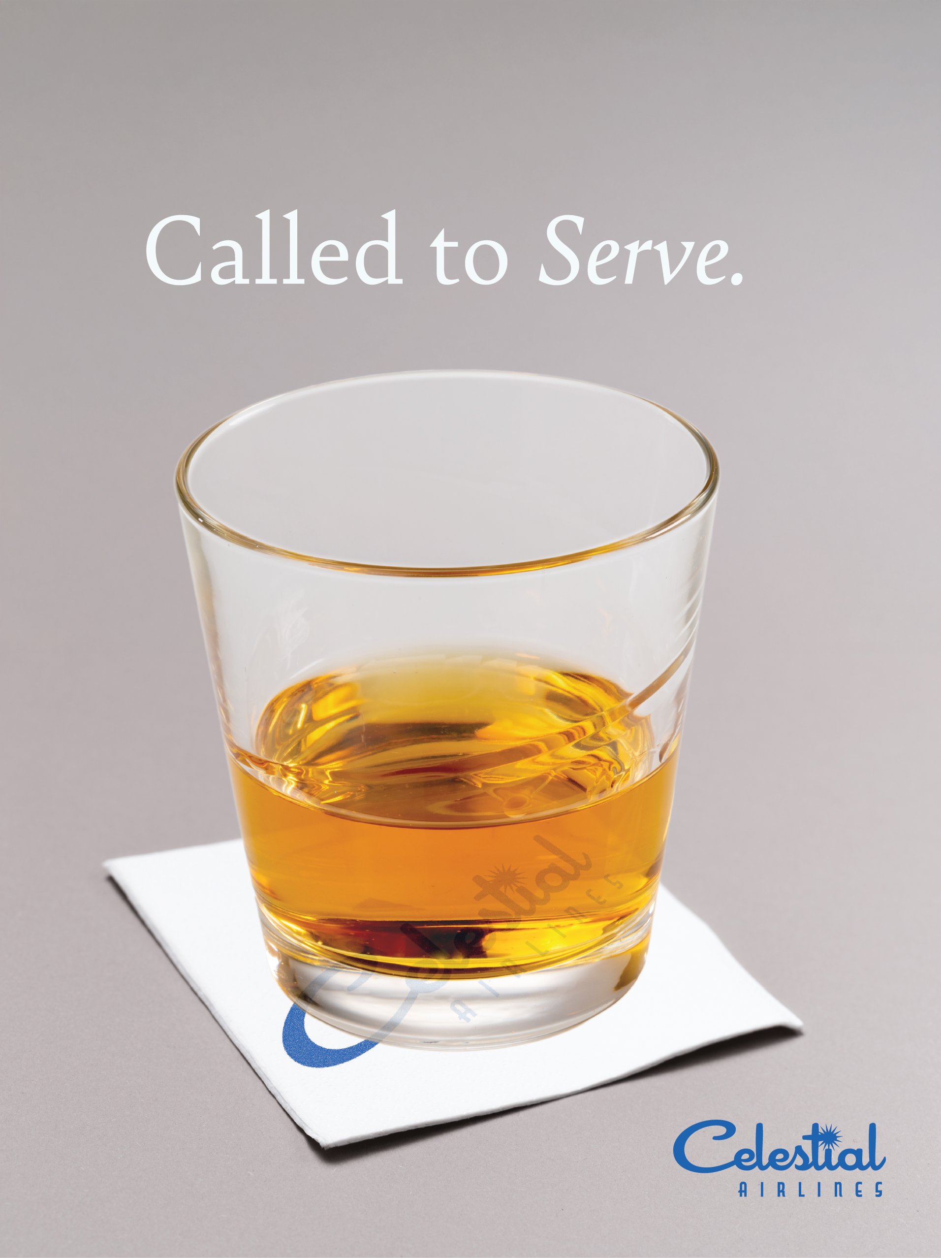
“Crash Course” referenced an activity they used to do with Mormon youth back in the day, so I quickly found ways to add little Easter eggs of Mormon references, which honestly were my favorite parts. For instance, on Tuesday evenings, the congregation’s youth met at the meetinghouse for “mutual.” I loved to name the color swatches, too. And if you’ve never had funeral potatoes, you’re missing out (and if you ask nicely, I’ll share my special recipe I lovingly call “Burn In Hell Funeral Potatoes.”
Typefaces used: Cocktail Shaker, Capitol, Bely.
Influences: Aviation and automotive typography from the 1950s, ‘60s and summery colors of the ‘60s and '70s.

classic
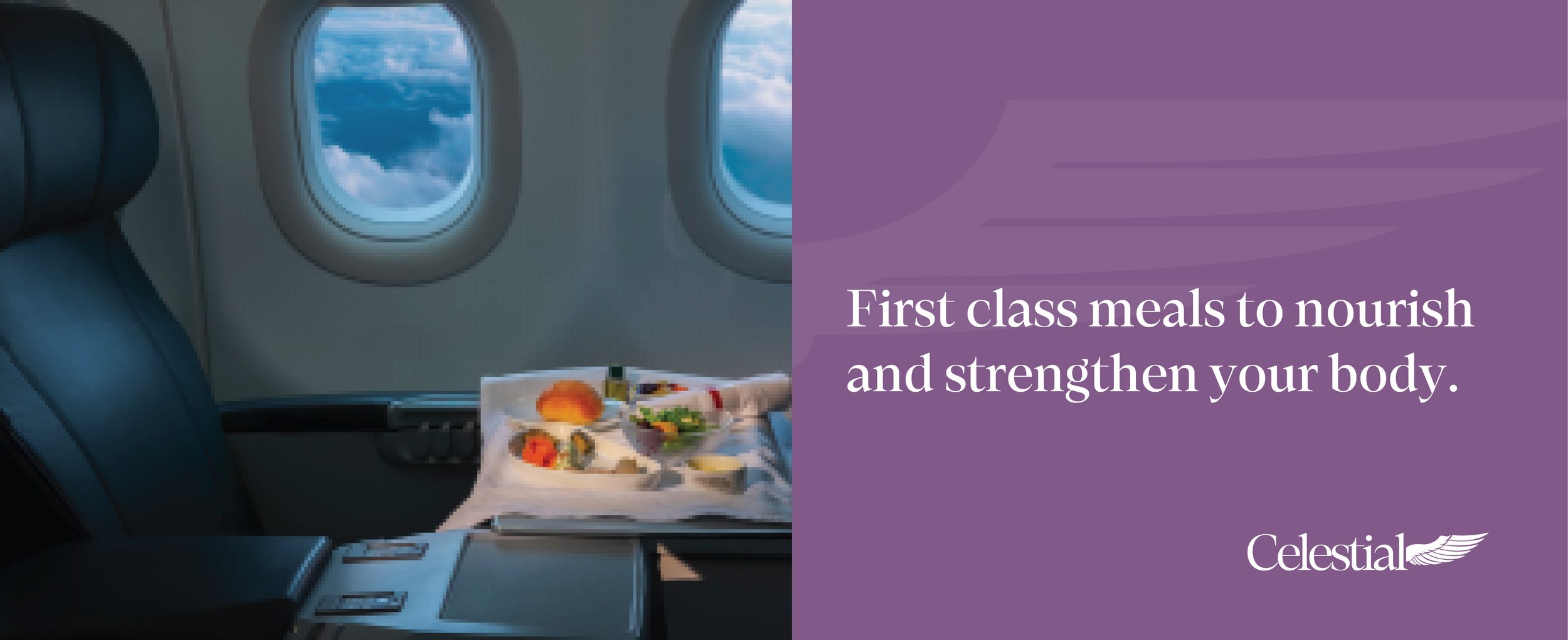
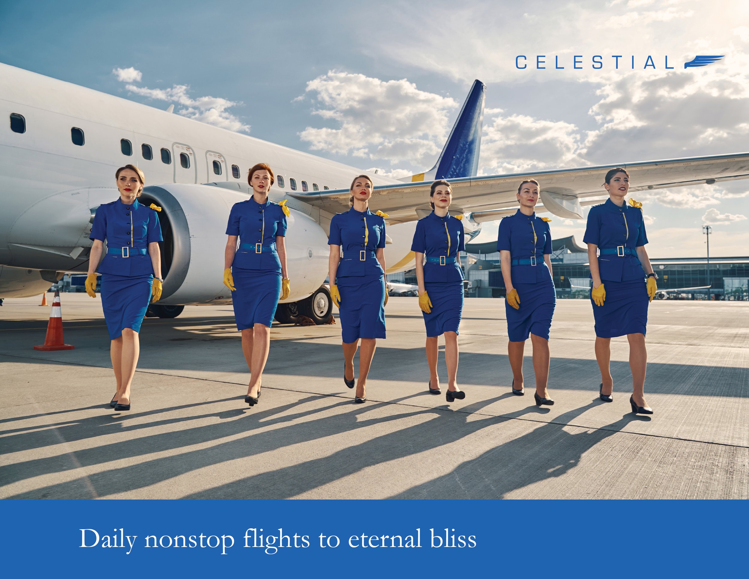
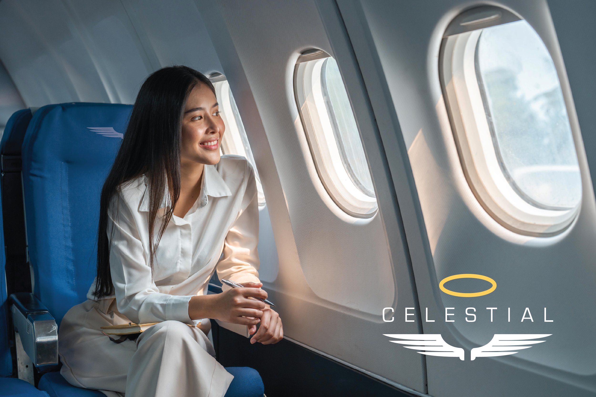
What colors come to mind when you hear heaven? I imagine white, of course. White robes, white wings, white clouds, etc. But what else? In “Classic,” I paired a rich, royal blue with a golden yellow, a winning color combo that never disappoints. I love the way it pops on a sky background full of soft, billowy clouds. It also made me think of those airline brands with a classic two-color combo: Delta with the navy and red, Continental with its navy and beige-gold. This version, minus the yellow, gives me a bit of the old Pan Am blue. Here is “Classic.”
Typefaces used: Eurostile, Garamond.
Influences: The simple color palettes of the world’s best airline brands, the appeal of luxury air travel, classic flight attendant style.

sunset
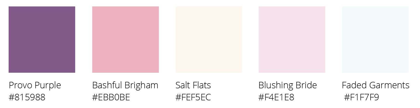
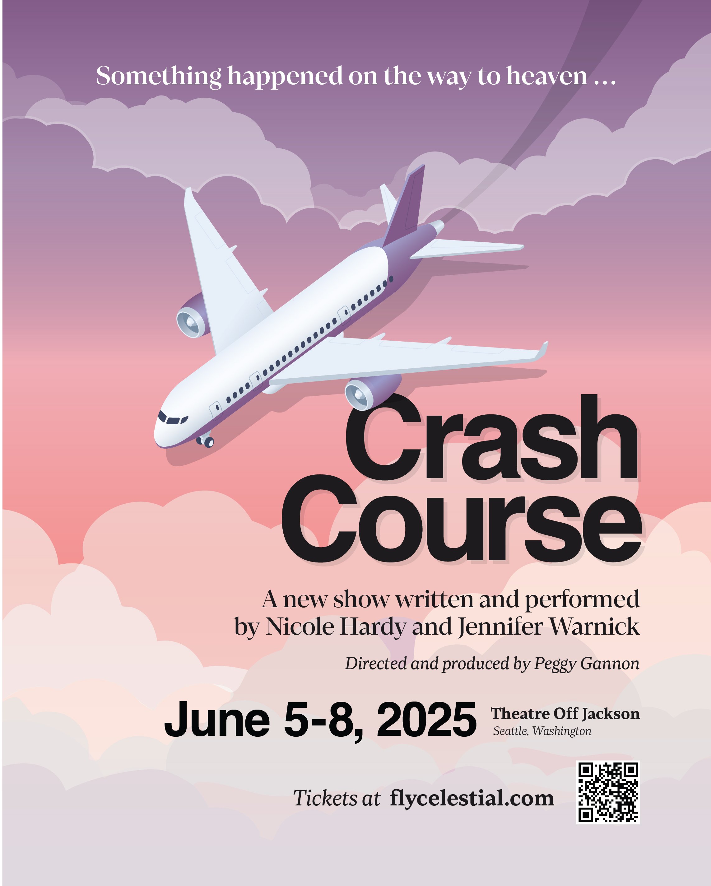
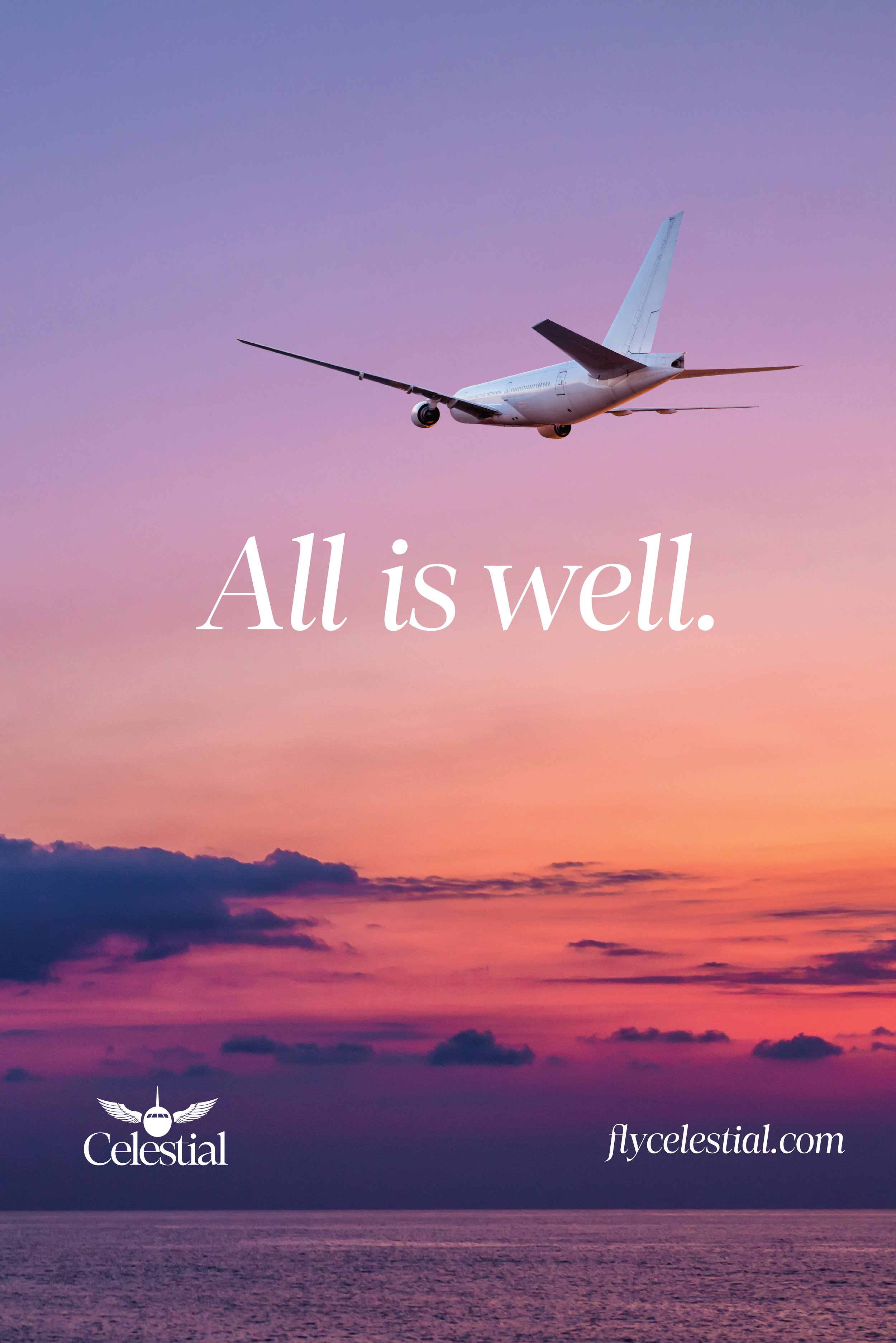
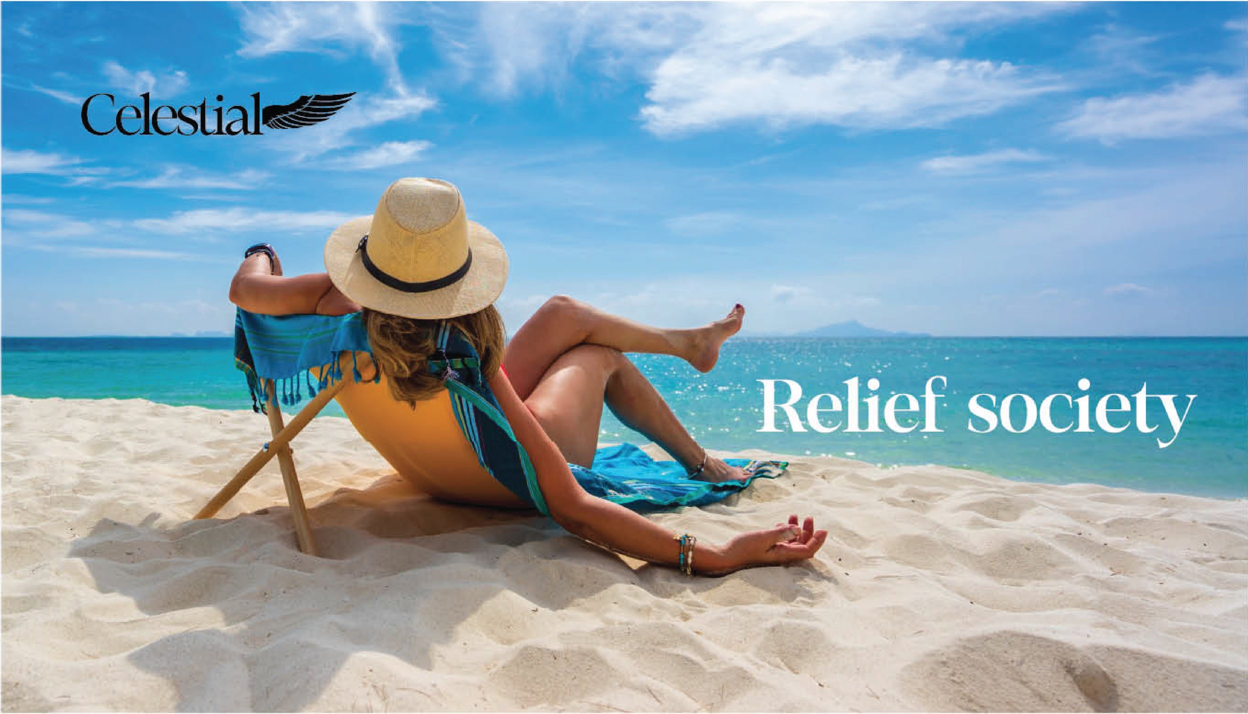
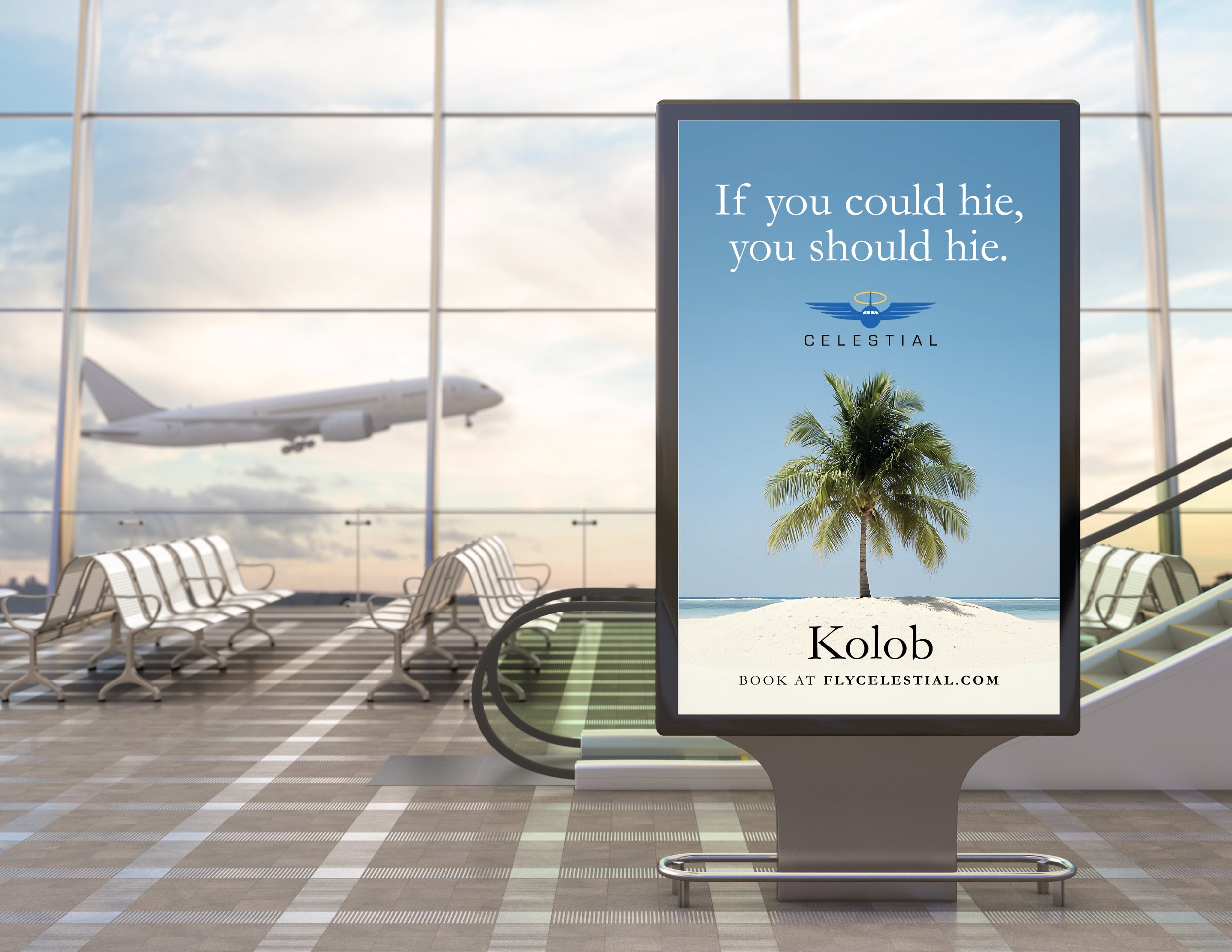
You’re floating on the clouds, bathed in hues of purple, peach, and pink. But it’s probably called “sunset” because on this particular fake flight, you fake die. You might be dead, but that ethereal feeling takes over any dread you might be feeling. Jennifer and Nicole opted to move forward with the sunset sketch. We took some of the things they loved from “classic” and implemented them here.
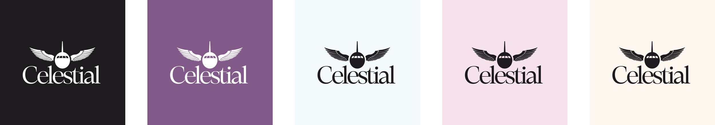
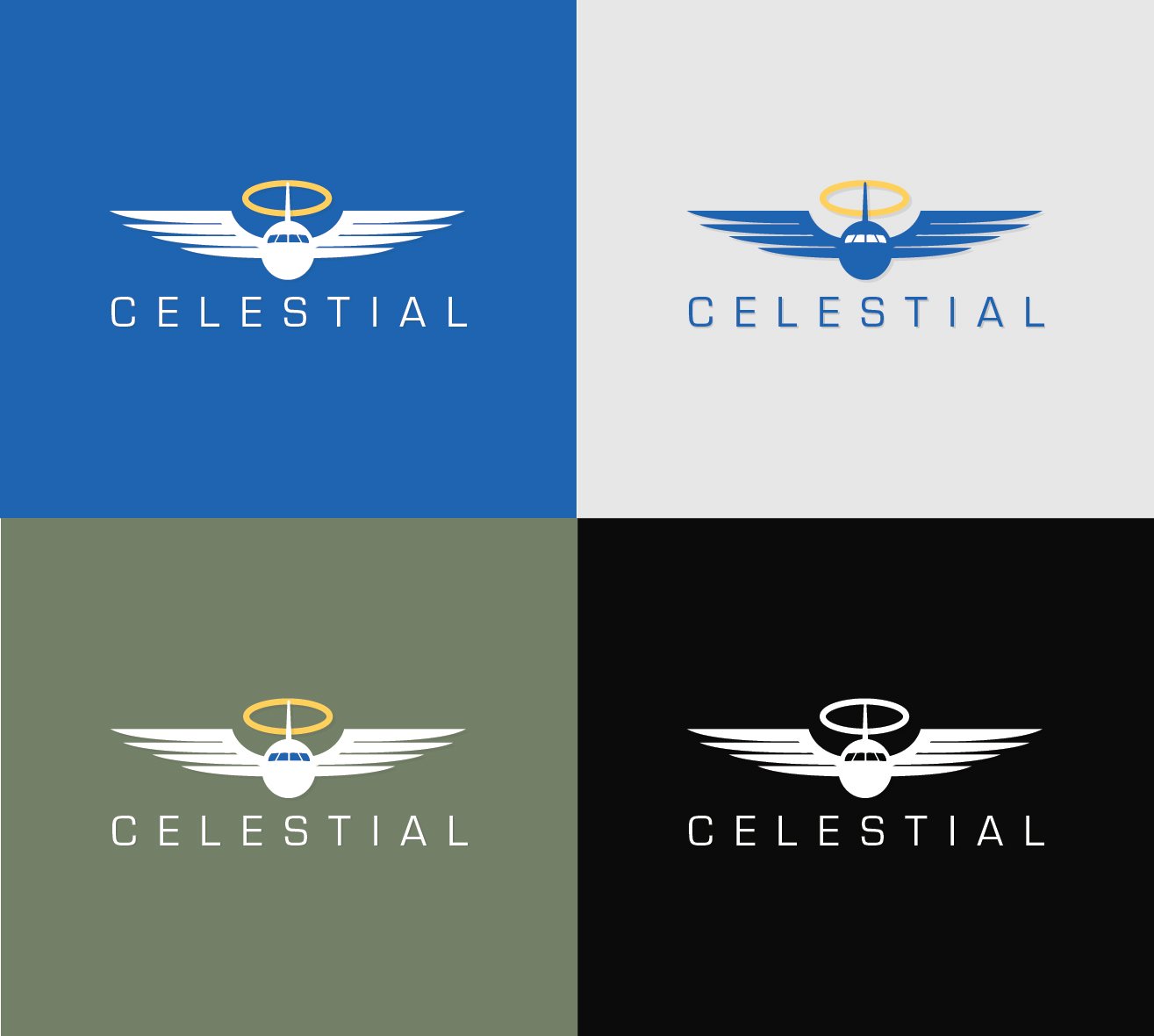
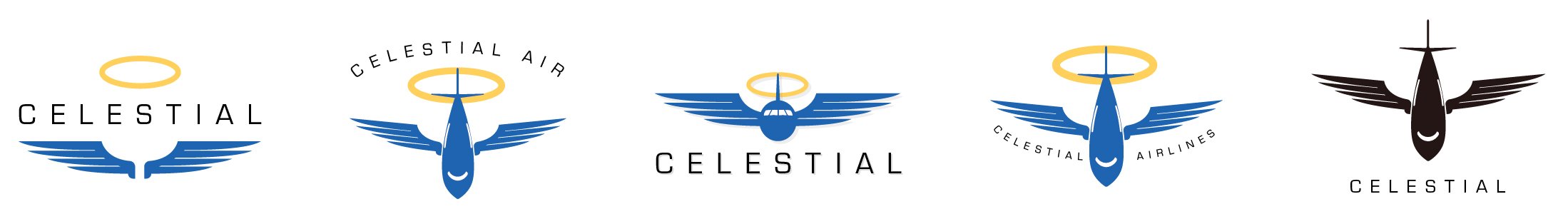
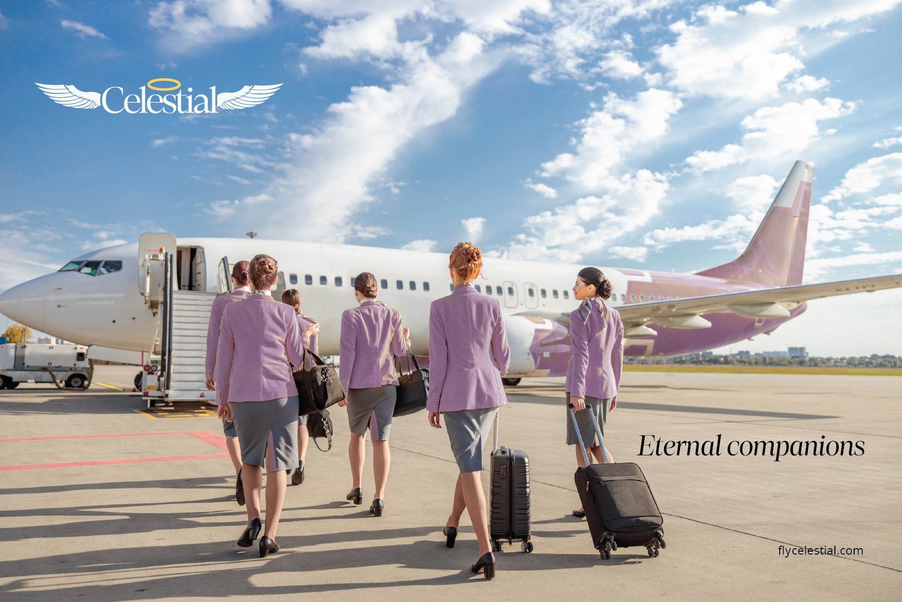
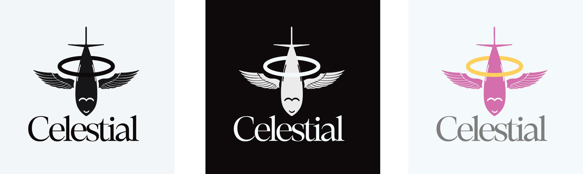
We ultimately simplified the Celestial logo by removing the halo, and for the primary logo, chose a P.O.V. that looked directly at the nose of the plane rather than the slight overhead like you see in the examples above. The secondary logo borrows from what we saw in the “classic” examples with a wordmark and a single wing. Below are final versions of the Celestial Air brand.
You can also read Crash Course’s show program, branded as Celestial Air’s in-flight magazine, Beyond, where you might recognize some of the advertisements you’ve seen here.
Typefaces used: Loretta.
Influences: Taking pictures from your airplane seat at 30,000 feet, the vibrant pastels of a soft sunset, Hawaiian Airlines, the calm of a resort or spa.